
Prompt Maker
ExploreTopicsPrompt libraryPrompt Maker Canvas
⌘ K
ExploreTopicsPrompt libraryPrompt Maker Canvas

Explore Prompt Maker

  • AI image prompts
  • AI video prompts
  • Creative workflows
  • Image tools
  • AI design workspace

About & services

  • Pricing
  • Terms of Service
  • Privacy Policy
  • Refund Policy

© 2026 Prompt Maker

ZHEN
All prompts/Image/New York, Seoul and Shanghai everyday composites

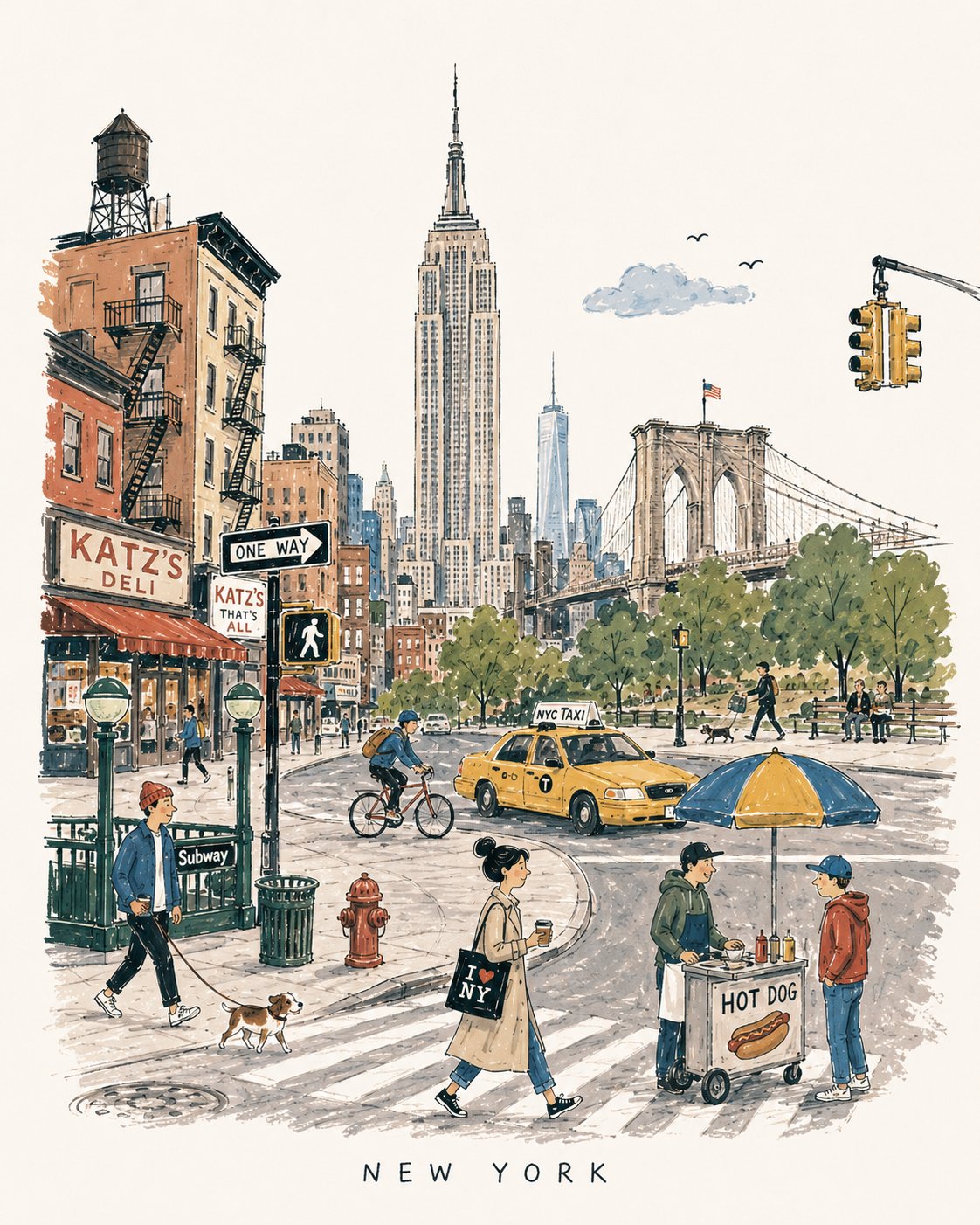
Mid-Century City Travel Picture-Book Illustration Prompt

Image

The complete template references 1950s–60s European city books, using loose ink, matte gouache, crooked buildings and ordinary residents for a 4:5 travel memory, explicitly rejecting map accuracy. Three examples labeled NEW YORK, SEOUL and SHANGHAI show landmarks, transport and daily activity, without independently verified labels or figure counts. Chinese mid-century was incorrectly medieval and is corrected. Study space, flat color and recognition without treating imaginary streets as routes or archival photographs. No generation occurred.

Image generation

Tool tags help you choose where to try a prompt. They do not verify which model or version created the example.

Prompt

01 / 01
[DESTINATION] = [CITY NAME]

Create a charming vertical 4:5 mid-century travel picture-book illustration of [DESTINATION], inspired by playful 1950s–60s European city books.

Depict the city as an affectionate, imperfect travel memory—not a map, postcard, architectural rendering, landmark collage, or cinematic panorama.

Include:
• 1 distinctive primary landmark
• 1 smaller secondary landmark
• 1 distant/partially hidden local feature
• 1 recognizable local vehicle
• 3–5 subtle everyday city details
• 5–6 ordinary people doing simple local activities

Compress these naturally into one imaginary street, plaza, park, or waterfront. Keep the primary landmark slightly off-center, with open foreground, shallow theatrical depth, gentle curves, and generous museum-white negative space. The city should be recognizable without feeling geographically accurate.

STYLE:
Hand-drawn picture-book illustration with loose charcoal/navy ink, trembling contours, crooked architecture, uneven proportions, sparse windows, simplified silhouettes, occasional double strokes, and minimal detail. Use the fewest lines necessary. Slightly awkward, intelligent, warm, humorous, and handmade.

PEOPLE:
Simple expressive figures with oversized heads, thin legs, narrow bodies, tiny faces, tilted accessories, and awkward but readable gestures. Show ordinary local life, not celebrities, models, stereotypes, or tourist clichés.

COLOR:
Use a restrained 6–7 color destination-specific palette with flat matte gouache shapes, uneven brush edges, white gaps, slight misregistration, and occasional color spilling beyond ink. Mostly unpainted sky/paper. No gradients or realistic shading.

MEMORY DISTORTION:
Gently compress geography and distort scale: distant landmarks may appear nearby, roads may curve strangely, buildings may overlap, and people/vehicles may be slightly oversized or undersized. Keep it balanced, affectionate, and culturally respectful.

OPTIONAL TEXT:
“[DESTINATION]” in small uneven hand-drawn capitals near the bottom. No slogans, dates, labels, logos, or promotional text.

AVOID:
Photorealism, map-like accuracy, landmark checklists, aerial views, cinematic lighting, technical perspective, dense crowds, detailed ornament, polished vector art, CGI, 3D rendering, gradients, sepia/beige paper, artificial aging, distressed textures, and hyper-detailed watercolor.

Overall feeling: [DESTINATION] remembered lovingly-recognizable, spacious, human, humorous, slightly improbable, and beautifully imperfect.