
Prompt Maker
ExploreTopicsPrompt libraryPrompt Maker Canvas
⌘ K
ExploreTopicsPrompt libraryPrompt Maker Canvas

Explore Prompt Maker

  • AI image prompts
  • AI video prompts
  • Creative workflows
  • Image tools
  • AI design workspace

About & services

  • Pricing
  • Terms of Service
  • Privacy Policy
  • Refund Policy

© 2026 Prompt Maker

ZHEN
All prompts/Image/Landscape anniversary, portrait opening card, countdown and renewal

Four Red Commemorative Poster Layout Prompts

Image

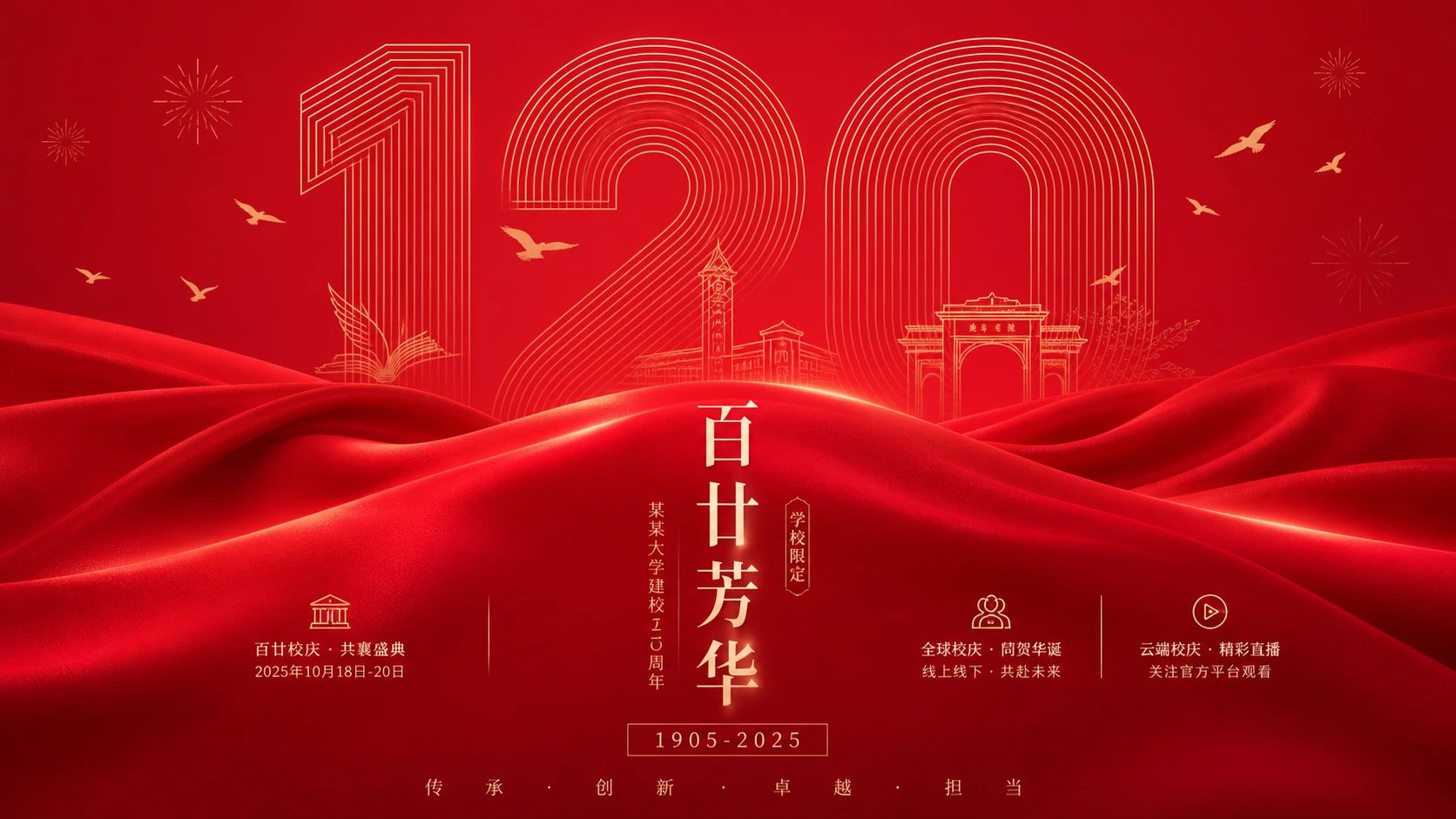
The complete source supplies four independent layouts: outlined numeral with silk for a school anniversary, an opened sleeve for a shop invitation, long-exposure red light for a countdown, and a giant glowing gateway for brand renewal. Each saved image matches one direction, with near-16:9, 3:4, 9:16 and 16:9 formats respectively. Choose one section at a time. The old English summary omitted detail and added logo/watermark bans absent from the source; all four sections are translated here. Schools, shops, dates and brands are unverified sample copy. No generation or printing occurred.

Image generation

Tool tags help you choose where to try a prompt. They do not verify which model or version created the example.

Prompt

01 / 01
Variant 1
Build a solemn yet bright commemorative celebration around any subject. Organize a strong central axis and leave a broad clean upper field. Enlarge the theme’s most recognizable date, numeral, character or symbol into a monumental focus, using extremely fine equally spaced continuous nested outlines to suggest depth. Let the outline approach the edges while preserving generous breathing space. Small theme-derived moving symbols may lightly cross or interrupt it, bringing life to strict geometry. Scatter only a few fine radial marks and light flying symbols at the top, varying scale and balancing asymmetrically; they suggest celebration without becoming an ornamental border.

Fill the lower foreground with broad satin-like fabric rolling in continuous waves from both sides. Near folds are bright and full, recesses deepen progressively, edges stay soft and reflections follow fold direction. Fabric covers the lower outline edge, clearly layering flat geometry against realistic material. Place the core Chinese title vertically on the central axis over calmer fabric, using dignified high-contrast serif forms with a clear vertical center and generous spacing. Pale lettering may have restrained warm glow but stays sharp. Beneath it place a tiny date within a fine rectangular frame, then a small widely tracked slogan at the bottom, moving reading from giant outline through fabric crest and vertical title to micro-information.

Derive color from theme meaning and emotional temperature: a large highly saturated, medium-to-high-lightness main color makes a clean celebration field; darker same-hue fabric recesses and background strengthen solemn depth. Outline, type and small symbols use a few pale low-saturation neutrals or soft material-inspired metallic highlights. Preserve a unified hue, distinct tonal levels and luminous clarity. Avoid muddy gray, dirt, aging and dazzling mirror highlights. Combine precise modern linear order, flowing silk softness and the ceremony of an Eastern celebration poster, keeping decoration subordinate to the memorial symbol and vertical information axis.

Theme: school-anniversary hero poster emphasizing the anniversary numeral and solemn festive atmosphere.
Small addition: include three relevant information points and a little anniversary copy for event promotion.
Format: landscape 16:9.

---

Variant 2
Organize any theme as an opened paper invitation object. A substantial outer sleeve opens in the lower-middle area; its front and side flaps form a stable enclosure, lifting a pale inner card from the opening. Leave a large quiet blank area above the card so the short theme phrase becomes the first read. Put a concise brand/theme mark above and time, signature or notes below, forming a vertical rhythm from mark through phrase, symbol and sign-off to time. Translate the subject into a small lower-card silhouette, paper stamp, fine-line motif or fastener rather than filling the page, as if a lucky token came with the letter.

Give the sleeve the theme’s most ceremonial dark saturated hue, large in area, low in lightness and soft in touch. Keep the background bright, warm and pale, the inner card nearly clean white, and type/linework in a darker related hue, with a few small pure-color objects as crisp accents. Paper has fine fibers, creases and ink absorption; edges are clean without sharpness and shadows thin and close to the surface. Keep everything bright, clean and warm rather than heavily dirty. Use high-contrast fine serif or Song-style skeletons, widely spaced title and tightly centered body, while lowering the presence of English or auxiliary small type. Short arcs, dotted rhythms and circular stamps echo the paper ritual. Preserve quiet tension among opening overlaps, blank card, tiny blessing symbol and large paper-color fields.

Theme: new-shop opening event card retaining a Chinese-red paper atmosphere and formal invitation feeling.
Small addition: retain a little event time and venue copy and three relevant information points.
Format: portrait 3:4.

---

Variant 3
Create a passionate, ambiguous, ceremonial poster around any subject. A large highly saturated warm light curtain sets the mood. Theme colors may vary, but preserve dark surrounding edges, strong light piercing the center and lower area, and a few dark masses restraining the brightness. The hero is abstract space made of rapid horizontal trails, soft bright vertical columns and translucent color blocks rather than a literal scene. Bands resemble long exposure, with streaked, feathered and locally overexposed edges. Dark red or theme-derived dark regions remain dense enough to make the lower-middle light flow a second reading focus.

Add fine grain and a slightly raised, moist print feel: bright areas glow cleanly, dark areas retain slight noise and compressed texture. Apply texture to color/light layers rather than uniformly distressing the image. The strongest typographic event is a huge fine handwritten title floating above, with long linked strokes spanning the width like white light crossing the background. Pair it with small high-contrast serif foreign-language text or a theme subtitle, quietly anchoring order with controlled tracking. Put core Chinese information in the lower-middle area in slim serif/Song-like forms with loose leading, offset against horizontal light. Smaller notes, time or joining details form a low voice at lower left and along the bottom. Extremely faint repeated microtype or watermark-like texture may add depth and paper feel. Preserve floating upper script, central open luminous mist and lower horizontal light/information rhythm. Avoid clear object displays, ordinary gradient backgrounds or uniform red templates.

Theme: festive-event countdown promotion emphasizing a lively opening and city celebration.
Addition: three relevant information points and a little event guidance copy.
Format: portrait 9:16.

---

Variant 4
Create a strongly commemorative graphic poster around any subject. Enlarge the symbol that best represents opening, arrival, renewal or entering into a glowing white form slightly left of center, like an opened three-dimensional door or monument. Keep its front geometric, substantial, clean and hard-edged. Extend a perspective dark side toward the rear right so the symbol simultaneously serves as title, architecture and light source. A theme-derived highly saturated warm field dominates the background, deep above and slightly brighter centrally while staying clean. Soft white bloom surrounds the main form; tiny gold light particles scatter between its right dark side and the background, concentrating along edges and the central reading zone like blessings revealed by doorway light.

Project a broad pale light path from the form’s base to create a distinct foreground ground plane. Its edges are sharp diagonals fading outward into the warm field. Place a tiny theme-related actor or symbolic silhouette on the right of the path, dark and partly backlit, moving toward the light or crossing the path with a long soft ground shadow. The size difference creates drama between immense symbol and personal action.

Restrain type: put a two-to-four-character theme headline vertically or tightly to the glowing form’s right, using high-contrast Song-like display forms with fine horizontals, thick verticals and sharp terminals in warm white or pale gold. Use small widely tracked low-density support text at an upper corner, beneath the main title and on the bottom baseline for ceremonial breathing rhythm. Derive colors from the theme rather than copying fixed hues: the main field carries warmth, white the sacred opening/focus, pale gold particles and typographic warmth, and deep warm shadows the figure, ground and depth. Keep the result bright and clean with slight edge bloom. Avoid reducing the symbol to ordinary flat oversized type, making particles uniform noise, or letting the figure steal attention from the giant light gateway.

Theme: brand-renewal launch commemoration emphasizing a solemn, encouraging new phase.
Addition: three relevant information points and a little celebratory copy.
Format: landscape 16:9.